Tag Archives: Responsive Design

seo-ranking-factors-header

2018 SEO Survey & Changes You Should Make in 2019

Moz has released the 2018 local search ranking factors last month & it reveals a lot about the upcoming big changes in the SEO world. If you are looking for accurate predictions, or just want to stay updated about the current trends, we recommend reading the full report.

2018 was a good year for Local SEO since we witnessed a major boost in the rankings of the local players instead of the corporates. This just solidifies the facts that no matter your size, if your site has what it takes, then there’s no denying that you can even beat the mega corporations.

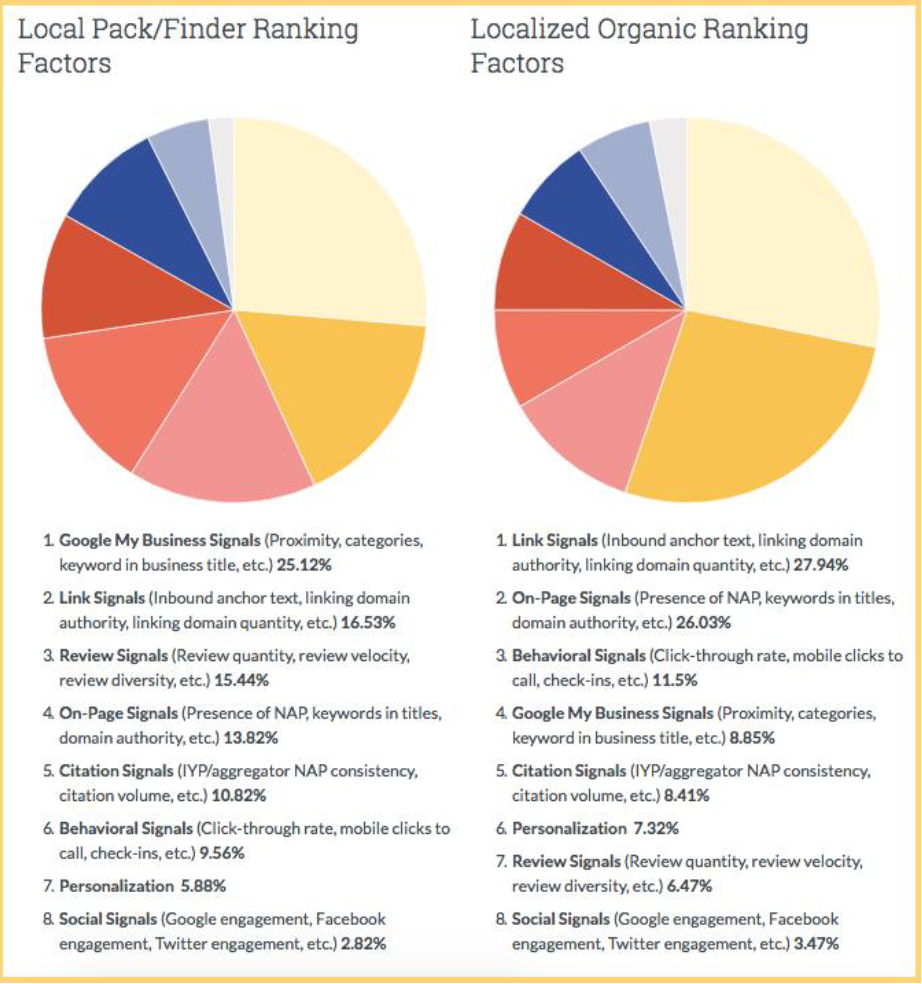
Keep in mind that this survey was conducted among the SEO professionals. They were asked to rank the main ranking factors. Here are some of the key findings.

seo-ranking-factors

Local SEO has changed drastically over the past 3 years and if you are sticking to old SEO practices, it will do more harm than good. Also, if you want your site to rank high, you will have to prefer quality-overquantity. Be it content, backlinks, reviews or citations.

It has been observed by many SEO professionals that you can manipulate the content on the knowledge graph. It mostly works for hijacking brand queries or getting clicks that you will not get normally.

Also if your site is not receiving the kind of traffic that you were expecting that maybe you have to send signals to Google. What it means is that if Google gets the “hey this business is alive signal”, it might boost your rank a little. You can then use this to show a detailed report of your SEO efforts. But you will have to figure out which thing to prioritize. Because there’s a lot of things going on and there’s a good chance that your client will not understand the technical things. So you may have to break it down in simpler terms.

Factors to pay attention to in 2019

An easy way to check for what Google thinks is important with internal links is to do a site search on Google, type in one of your keywords & see what comes up first. This will help you determine what Google thinks is most relevant for your keyword. And if the result is not what you expected, fix it and do a search with the same keyword again.

If your business is new, you have to ensure that you have covered all these basics.

1. Order Citations

2. Website is up and running.

3. Page loads quickly.

4. High quality and relevant content

5. Add schema to the site

6. You are using Google My Business posts

7. You’re responding to Questions asked via knowledge graph listing

If your business is around for a while, it is going to take a lot more efforts. You can start by checking the source of the traffic, if you are paying for it, then is it converting? Are your blogs up to date. Are you regularly uploading high quality content? These are only a few of the questions that you should ask yourself about your website.

Be informed that GMB categories are a major ranking factor. Therefore it is often manipulated BUT GMB related spam can be reported on Google Maps or escalated to Google via their various support channels. So if you see anyone misusing it, you should report it.

The conclusion of the survey is hard to sum up but if you will pay attention to the details, you will be able to crack the secret ingredient to a successful local SEO strategy. Although, you will have to do a lot of research to revise your current plans without hurting the existing campaigns.

For more SEO tips and the latest updates in digital marketing, contact us to learn more!

ppc-updates-december

PPC Updates for December 2018

For more information on these PPC updates and latest SEO Trends

Connect with us to learn more!

Google-slow-page-speed-header

Google Sends Email to Slow Loading Websites Suggesting Improvements

Google is sending emails to site owners who are struggling with site speed via Google Search Console. The intention is to help them identify and fix the slow loading pages. Here’s the email.

“Google has noticed that your site’s performance is significantly below average. Real user measurement data from the Chrome User Experience Report shows that pages on your site are slow to become interactive. This can have a severe negative effort on your business metrics and can cause user frustration. 

Speed is a ranking factor for both mobile and desktop search results. While we don’t disclose the exact factors used for ranking, we recommend using a variety f metrics to understand your site’s performance, including first content paint, time to interactive, and first input delay. In particular, 8.70% of loads on this site have a slow first input delay and 39.7% have had a slow first contentful paint.

Our takeaway: Speed is crucial for both mobile and desktop version of your site and it is officially part of the algorithm. It not only help you with your SEO efforts but also massively boost the user experience since most of the users want a fast loading page. So site speed means better ranking and it also directly boost the conversion rate. Hence it is a very crucial aspect of your site which you should be paying attention to.

Need help with site load time? Connect with one of our Sales reps to assist you further.

responsive-design-website

4 Common Mistakes To Avoid While Creating a Responsive Website

Mobile usage has escalated enormously in the past few years. It has surpassed desktop
searches in 2015 and is still growing. And it’s not just mobile, people are accessing the web via
Tablets, Netbooks and even smart TVs. Overall it’s safe to say that the way people accessed
the web has changed completely.

But it took some time for the marketers to pick up the change. On one hand, we had
mesmerizing desktop websites, on the other hand, there were slow loading websites with a lot
of bloated images for mobiles and tablet users, just opposite to what they expect.

In this difficult time, responsive websites came to marketer’s rescue. However, it’s not a
magical tool that will boost conversion rate on its own. You have to pay attention to even the
minutest details and make sure there are no issues.

We are sharing the top 4 common mistakes that marketers make when creating a responsive website and how to avoid them.

1. Bloated images

It’s crucial to keep in mind that responsive website makes use of a single markup for all
devices. So to ensure that you are sending the right image to the right device, use following
tricks.

  • Run images though ImageMagick for an optimal size.
  • Maintain high depth even after reducing the image size by using Lossy Compression.
  • Use multiple servers to render images.

2. Slow load page time

Mobile and tablet users are always on the go, so if your page load time is slow, you are losing
on a lot of prospects. According to a recent research, more than 40% of the visitors will
abandon a website if it takes more than 3 seconds to load.Mobile users command a seamless web suffering, and fast loading pages are a big part of it. Use Google’s PageSpeed Insights tool to analyze your site’s performance. It provides you with valuable information using which you can boost the speed of your website.

3. Long forms?

Ain’t nobody got time for that. If a site visitor is on your contact page, it means he is HIGHLY interested, losing him at this point is like losing a definite sale. The best way to compel the visitors to fill your form is to keep it short and simple. Don’t ask for too much information at once. First get basic info like Name, Phone number, and Email address — you can ask for more information later. A good case in point is Expedia. Little did anyone knew that a small mistake, like placing a long form will cost them a whopping 12 million dollars. Don’t make that mistake. Keep it short and simple, you will get much more leads.

4. Not taking mobile users intent into consideration

Responsive design doesn’t take mobile users goal into consideration. So you have to pay attention to it, Make sure that your mobile site is easy to navigate, especially for the dudes with big, fat fingers. Also, cramping a lot of content will do more harm than good. You are distracting the users from taking an action by putting long titles and a lot of text on the screen. Also, make sure that your site design is neat and clean. So that users can get wherever they want in no time.

Looking to build a responsive website? We can help. Just connect with one of our Sales reps to get started.

Top features of our Google Mobile Friendly Website:

  • Responsive website recognized by Google as mobile friendly.
  • Click-to-Call, Click-to-Email and Click-to-Text features.
  • Advanced mobile lead tracking and analytics.

GOOGLE RECOMMENDS HAVING A RESPONSIVE DESIGN STRUCTURED WEBSITE

We have repeated this numerous times and here it is again. Choosing a Responsive Website design structure over a Mobile-only design. This time, we have decided to share the latest video from Google’s, Matt Cutts himself.

Matt explains that a Responsive design is nothing but good for your website in the eyes of Google. We believe responsive websites are given more preference in the SERPs. And unlike a Mobile-only template, responsive designed websites are not as prone to technical errors. They also allow you to keep all of your domain’s authority factors (link juice, URL structure, on-site SEO implementations and content) in one place, rather than having to optimize both your mobile website and your full website. This keeps your SEO more simplistic as you will have to optimize only one site instead of focusing on two different websites.

Simply said, Responsive web design is the BEST choice you can opt for from a long term perspective.