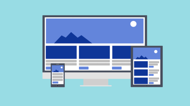
Mobile usage has escalated enormously in the past few years. It has surpassed desktop
searches in 2015 and is still growing. And it’s not just mobile, people are accessing the web via
Tablets, Netbooks and even smart TVs. Overall it’s safe to say that the way people accessed
the web has changed completely.
But it took some time for the marketers to pick up the change. On one hand, we had
mesmerizing desktop websites, on the other hand, there were slow loading websites with a lot
of bloated images for mobiles and tablet users, just opposite to what they expect.
In this difficult time, responsive websites came to marketer’s rescue. However, it’s not a
magical tool that will boost conversion rate on its own. You have to pay attention to even the
minutest details and make sure there are no issues.
We are sharing the top 4 common mistakes that marketers make when creating a responsive website and how to avoid them.
1. Bloated images
It’s crucial to keep in mind that responsive website makes use of a single markup for all
devices. So to ensure that you are sending the right image to the right device, use following
tricks.
- Run images though ImageMagick for an optimal size.
- Maintain high depth even after reducing the image size by using Lossy Compression.
- Use multiple servers to render images.
2. Slow load page time
Mobile and tablet users are always on the go, so if your page load time is slow, you are losing
on a lot of prospects. According to a recent research, more than 40% of the visitors will
abandon a website if it takes more than 3 seconds to load.Mobile users command a seamless web suffering, and fast loading pages are a big part of it. Use Google’s PageSpeed Insights tool to analyze your site’s performance. It provides you with valuable information using which you can boost the speed of your website.
3. Long forms?
Ain’t nobody got time for that. If a site visitor is on your contact page, it means he is HIGHLY interested, losing him at this point is like losing a definite sale. The best way to compel the visitors to fill your form is to keep it short and simple. Don’t ask for too much information at once. First get basic info like Name, Phone number, and Email address — you can ask for more information later. A good case in point is Expedia. Little did anyone knew that a small mistake, like placing a long form will cost them a whopping 12 million dollars. Don’t make that mistake. Keep it short and simple, you will get much more leads.
4. Not taking mobile users intent into consideration
Responsive design doesn’t take mobile users goal into consideration. So you have to pay attention to it, Make sure that your mobile site is easy to navigate, especially for the dudes with big, fat fingers. Also, cramping a lot of content will do more harm than good. You are distracting the users from taking an action by putting long titles and a lot of text on the screen. Also, make sure that your site design is neat and clean. So that users can get wherever they want in no time.
Looking to build a responsive website? We can help. Just connect with one of our Sales reps to get started.
Top features of our Google Mobile Friendly Website:
- Responsive website recognized by Google as mobile friendly.
- Click-to-Call, Click-to-Email and Click-to-Text features.
- Advanced mobile lead tracking and analytics.